Friday, 9 December 2011
Tuesday, 6 December 2011
Evaluation Activity 4
How did you use new media technologies in the construction and research, planning and evaluation stages?
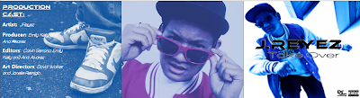
 |
| (I created the above picture quickly using Word.Doc and Paint.) |
Blogger: I used this to create this blog as well as follow other blogs. We have used this throughout our coursework to record the construction, research,planning and now the evaluating stages of our music video.
YouTube: I used this to research into existing music videos and music videos specific to our music genre of R&B. Our group also used this to look at Youtube documentaries in our genre. We used You Tube alot during our project for inspiration,ideas,etc.
Time Glider: I used this to create a timeline of the history of music video.This was easy to use and with pictures added on each date looked quite effective.
Prezi: I used this to create my Star Study and my music genre comparision/analysis. This was easy to use and made my work look like an interactive presentation.
Slideshare: I created a presentation on our chosen song choice which included the planning of extras,props,audience,representation,actors,location, media language and key lyrics with this. It was an easy way to upload powerpint presentations and word.docs to our group blog and my blog.
Go! Animate: We will use this to create Evalaution question two. Our group wanted to be different instead of filming ourselves for question 2 of the evaluation we created an 'interview styled' animation.
Wordle: I used this to create 'word clouds' for Evaluation Activity 3 to show our peer assessment feedback. This is a different, more visually pleasing way to show good feedback and what our group could improve about our main product and ancillary products.
DSLR camera for photo shoot: This gave our group high quality photographs to work with which makes our magazine advertisement look of a better quality and a professional feel.
Microsoft Powerpoint: We used this to create our presentations on our work
www.dafont.com: This where are group got the two different fonts for the artists name (J.REYEZ) and the album name (Take.Over) from. We used these fonts on our album cover and magazine advertisement. This had a huge variety of different fonts to choose from in different themes which allowed as to find ones that fitted our music genre.
Survey Monkey: As a group we used this to create an audience research survey so we could undertsand our target audiences age, if they listened to R&B and Rap, what they expected from an R&b music video,etc.This survey worked well as people didn't mind completing surveys online as they can be done quicker.
Survey Monkey: As a group we used this to create an audience research survey so we could undertsand our target audiences age, if they listened to R&B and Rap, what they expected from an R&b music video,etc.This survey worked well as people didn't mind completing surveys online as they can be done quicker.
MSN/Hotmail: Our group used this to communicate between each other and send large attachments such as the fist drafts of the magazine advertisement and album cover. I also used MSN to post our groups audience survey form survey monkey to get more replies/answers from a wider range of people.
Facebook: This was used to remind extras and helpers included in our music video or it production the times,dates and locations that they needed to be at.This proved very effective and was less time consuming then phoning or speaking to them,etc.
Facebook: This was used to remind extras and helpers included in our music video or it production the times,dates and locations that they needed to be at.This proved very effective and was less time consuming then phoning or speaking to them,etc.
Microsoft Word:We used this to edit images quickly when needed and to printscreen from. I used word to create a general magazine advertisement analysis.
Paint: We used this to edit images and for quickly editing still frames for analysis.
Adobe Photoshop: Our group used Photoshop to edit images for the album cover and magazine advertisement. We used this program alot and our group already had experience working with it which helped our editing to be less time consuming and of a higher quality.
HD video camera and tripod to film the music video:This helped our music video as the HD video camera has a better picture quality, this was important as we edited the colour on each shot so we needed it to be seen clearly.Digital camera for location shots: I used a digital camera to take pictures of Location before or when our group where at them. I then uploaded these to our group blog.
Apple Mac: We used the mac to create our music video and animatic on. We also used the mac to research on during lessons.
iMovie HD (for animatic and album discussion): Our group used iMovie as we have worked with it in the past and it is very easy and quick to use and edit clips with. Apple Mac: We used the mac to create our music video and animatic on. We also used the mac to research on during lessons.
Final Cut Express: Our group created our music video with this program. Overall we worked well in this program and used a variety of different effects, transitions and colour features that were on the program.
Evaluation Activity 3
What have you learnt from your audience feedback?
Our group created the following to get feedback from people from our music video and ancillary products:
- Peer assessment of the rough cut of our music video.We asked students in our class to complete a form and to write down the good things about our music video and any improvements we could make.
- Peer assessment on the rough first draft of our digipak. This was very helpful as we did need to make adjustments and it also picked up on other sections that weren't nessessary, e.g the barcode (see below).
- Peer assessment on our final music video. People wrote down improvements we could possibly make if we had omore time or if we were to do it again.
- Peer assessment on our final digipak and magazine advertisment design (ancillary products).
Our group created these:
- Questionnaire on our final music video.
- Questionnaire on our ancillary products.
What was good about the rough cut of our music video:

What needed improving on the rough cut of our music video:

From our peer assessment we learnt that our music video needed tightening up especially on some parts of the lip syncing and we needed more close-ups on our artist. We also needed to fill in the gaps inbetween footage, which was becuase we hadn't finished editing quite yet. We were also told we had room to take some risks e.g by adding in more effects and tranisitons, although they still needed to be relevant to our music genre. We also needed to improve the colour, brightness and contrast which we were currently doing at the time. We needed to improve the brightness on the night time shots so that the artists lip syncing could be clearly seen. Our group also realised that some shots needed to be shortened or split in half and used in different places to create a fast paced feel to our music video.
Good things about the rough draft of our digipak:

Improvements that were needed on our rough cut of our digipak:

From our peer assessment our group learnt that we needed to create a more edgy and unique look to our digipak. We also needed to improve the fonts we used as people could not see the punctuation clearly and the artists signature was small in comparison to the writing inside the booklet. We also needed to check some of our spelling on the digipak. From our peer assessment people said they liked the editing on the photographs we took, the blue colour scheme and the fonts for the artists name and the album name.
On the booklet inside the CD case we included a barcode on the digipak with the artist name J.REYEZ underneath it. Many people were confused why a barcode was inside the booklet. Our group created the barcode as it labelled the artist with a ' unique code' showing he was becoming more recgonised and we wanted to show that the artist had his own style and image/logo. After a group discussion we decided to remove the barcode as it would cause unnessessary confusion as it was not clear why it was inside the CD booklet.Close-up of Barcode:

Before (with barcode):

After, without barcode (centre picture in the middle of booklet)

This design is now less confusing as the barcode drawed away
attention from the artists image which we didn't want.
Questionnaire on our final music video and our final ancillary products:
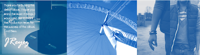
The last page shows comments and feedback from social networking sites such as facebook and through emails. (The last comment on this page is from someone studying film at university.)
Prezi we did together as a group on Evalaution Activity 3:
We did this Prezi as a group (the rest of this post is done by me)
Evaluation Activity 2 (animation done as a group)
How effective is the combination of your main product and ancillary texts?
We did the animations below as a group, below each animation is the script for that part (1,2,3).
How effective is the combination of your main product and ancillary texts?
Our main product and ancillary text link well with each other.
Why do you think that?
Our group started by discussing and brainstorming different ideas into existing RnB products. From this discussion, we learnt that RnB artists image is important as they want to promote themselves, and to be recognised. We took this into account and made our music video and ancillary products with the artist's image as the main focus.
What features have you placed in your products that are effective?
One of the features we included was the blue colour scheme we carried throughout our products. The colour blue symbolises optimism which relates to the main single of the album this implies that the artist is determined to reach his ambitions. The colour blue also symbolises wealth and business which also links to our products. Another feature we used was the close-up of the artist. We used this on our music video and ancillary products as this is important to promoting the artist as well as showing his authority and personality.
Finally, we carried a modern theme for our music video and ancillary product by our choice in mise-en-scene, location, costume and editing. This is important because it relates to our music genre, R&B as it reflects the continuous growth of the modern society and the music industry.
What was the idea behind the album cover?
We researched into existing album covers and found that the artist's image is the main focus as this is important to up and coming artists. This builds their image and promotes the artist and his music. We chose the album title, 'TakeOver' because it relates to the album's theme of being determined to reach recognition. This is supported by the effective use of font that fit our music genre and the modern theme.
What was the idea behind the magazine advert?
We analysed existing magazine adverts from different genre and see the difference between. For our inspiration, we chose Rolling Stone, XXLMag and RWD as they promotes our music genre well to the target audience. We presented a close mid-shot of the artist as we want to attract the audience's attention to the image to promote the artist and his music.
This is also effective as the artist is only starting and the artist needs recognition. The white background is effective as it makes the artist stand out, and it symbolises strength, wholeness and completion.
Are you happy with the final outcome?
As a group, we feel that we have done a great job and we have achieved our initial aim of creating product to fit with our music genre whilst making it look professional. Our products are eye-catching and interesting from the ideas our group had.


 Our magazine advertisement incorporates the artist. It shows clearly the album is available from iTunes and also shows the front cover of the album. The black and white main colours show the artists image is important compared to the background which contrasts against the artist making him stand out. We have carried the same fonts over from our Digipack, the artists name is in the same font and the album name is also in the same font. This was important as an artists font/style needs to be easily identified as their own e.g well known artists such as Chris Brown and David Guetta use the same font on every album they create so they are easily recognisable even if their s no image of the artist on the front. We used the same fonts so that when people glance at the magazine advertisement or digipak they begin to know and recognise our artist straight away.
We did the animations below as a group, below each animation is the script for that part (1,2,3).
How effective is the combination of your main product and ancillary texts?
Our main product and ancillary text link well with each other.
Why do you think that?
Our group started by discussing and brainstorming different ideas into existing RnB products. From this discussion, we learnt that RnB artists image is important as they want to promote themselves, and to be recognised. We took this into account and made our music video and ancillary products with the artist's image as the main focus.
What features have you placed in your products that are effective?
One of the features we included was the blue colour scheme we carried throughout our products. The colour blue symbolises optimism which relates to the main single of the album this implies that the artist is determined to reach his ambitions. The colour blue also symbolises wealth and business which also links to our products. Another feature we used was the close-up of the artist. We used this on our music video and ancillary products as this is important to promoting the artist as well as showing his authority and personality.
Finally, we carried a modern theme for our music video and ancillary product by our choice in mise-en-scene, location, costume and editing. This is important because it relates to our music genre, R&B as it reflects the continuous growth of the modern society and the music industry.
What was the idea behind the album cover?
We researched into existing album covers and found that the artist's image is the main focus as this is important to up and coming artists. This builds their image and promotes the artist and his music. We chose the album title, 'TakeOver' because it relates to the album's theme of being determined to reach recognition. This is supported by the effective use of font that fit our music genre and the modern theme.
What was the idea behind the magazine advert?
We analysed existing magazine adverts from different genre and see the difference between. For our inspiration, we chose Rolling Stone, XXLMag and RWD as they promotes our music genre well to the target audience. We presented a close mid-shot of the artist as we want to attract the audience's attention to the image to promote the artist and his music.
This is also effective as the artist is only starting and the artist needs recognition. The white background is effective as it makes the artist stand out, and it symbolises strength, wholeness and completion.
Are you happy with the final outcome?
As a group, we feel that we have done a great job and we have achieved our initial aim of creating product to fit with our music genre whilst making it look professional. Our products are eye-catching and interesting from the ideas our group had.
Our Ancillary Products:
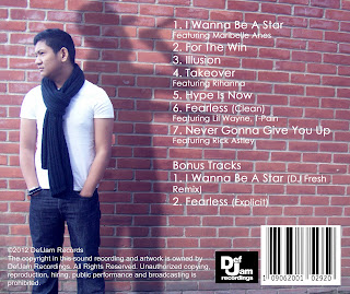
Our CD Digipak Booklet (front cover on the far right)
Close-up of Front cover

Back of the booklet
We had a blue colour scheme that ran throughout our music video which we carried over to our ancillary products. The front cover is modern and incorporates our colour scheme effectively. Also include don the cover is our record company Def Jam Recordings and the Parental advisory sign. Our fonts link well with our genre and stand out against the main image of the artist. We wanted the artist as the main focus of the digipak.
Back of the CD.
Inside CD cover (what the actual CD is placed over)
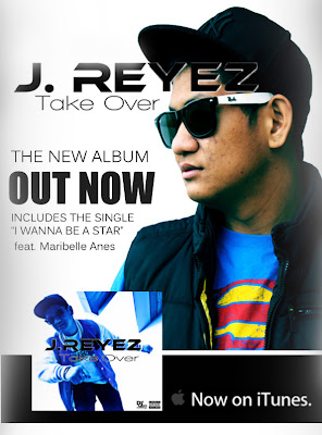
Our Magazine Advertisement
Our magazine advertisement incorporates the artist. It shows clearly the album is available from iTunes and also shows the front cover of the album. The black and white main colours show the artists image is important compared to the background which contrasts against the artist making him stand out. We have carried the same fonts over from our Digipack, the artists name is in the same font and the album name is also in the same font. This was important as an artists font/style needs to be easily identified as their own e.g well known artists such as Chris Brown and David Guetta use the same font on every album they create so they are easily recognisable even if their s no image of the artist on the front. We used the same fonts so that when people glance at the magazine advertisement or digipak they begin to know and recognise our artist straight away.Evaluation Activity 1
In what ways does your media product use, develop or challenge forms and conventions of real media products?

1. Setting/Location
This setting/location is really effective in our music video as it links well to our R&B music genre. Also because the London Eye is a famous and well recognised landmark viewers can easily identify with it. This is also an urban location which links closely to our music genre. This shot is taken from a low angle to emphasis how large the London Eye is and to show its scale. The artist singing also looks authoritive in this shot as she is looking down at the camera.
2. Lighting
Lighting was really important in our night time shots as the artists face needed to be seen clearly. In this shot both artists were effectively positioned so that overhead lighting shone down on their faces lighting them up so their singing could be easily seen. The night time shots are gradually introduced at the end of the first rap showing a change in day and a change from the first rap to the second chorus sung by a different artist.
3. Relationship of lyrics to visuals
This shot is on the line 'Now im heading to the top now...' .This is a key lyric as it relates to the artists rise to fame and recognition. This can be seen through the artists movement and the authority he has over the shot. As our music video is perfomance based it was important that the artists movement on screen linked to the lyrics and their meanings.The split screen editing also aids this.
4.Mise-en-scene
Costume was very important in shots with other actors/extras in as the clothing needed to fit the R&B genre but not dominate the shot, as we still wanted the artist to be the main focus. The main artist wore a baseball cap and large sunglasses which showed his self-confidence and determination to become more recognised in his music and style. When casting we had to consider costume, appearance and make-up that fitted the style of our music genre.
5.Camerawork and Editing
In this shot we have the main artist dipping down towards the camera in a dance move and then quickly backing away from the camera. The camera was set at a very low angle (the shot was taken lying flat on the ground) so it made the artist look like he was in control and powerful. When we edited this shot we used the original and then copied it and reversed it. We edited the colour on this shot turning the artist into a silhouette against the bright blue sky. We also edited the overall speed of the shot to make it match the time of the music and lyrics on screen. The inspiration from this shot came from Tinie Tempah 'Written in the stars'(below, click to enlarge).
 6.Intertextuality or influence of other music video
This shot is on the line of ' Cause im just a silly asian' we emphasized this by doing a series of shots quickly zooming out from the artists face, where he is taking his sunglasses on and off, showing his eyes. The sunglasses were a key prop as they suggested the artists wealth and status. This suggests the artists background/culture which relates to the music genre and other R&B/Rap music videos.
7.Genre of music and how it is defined
Our music genre was R&B/Rap so we had to consider setting/location, mise-en-scene, props,etc so that it would be relevant to our chosen genre. We used a variety of different shot types, angles, heights, camera positions and movement to fit the genre of our music as R&B typically include a variety of shot distances at a fast pace to involve the viewer and keep them interested and focused on the main artist.
8.Relationship of music to visuals
This shot is on the line' And I gotta jump to the next step'.The music and visuals link well together as the movement of jumping on screen (on beat) relates clearly to the line and although this is a quick shot it links closely to the music.
9.Representation of artist with reference to record label's expectations
We had a variety different close-ups on our artist as all R&B music videos include them. The artist was the main focus of our music video and his style was important. This links to Goodwin's rule 'The demands of the record label will include the need for lots of close-ups of the artist and the artist may develop motifs which recur across their work (a visual style)'. As a group we had to carefully think about costume and style as R&B/Rap is a modern and contemporary music genre which is constantly changing, so fashion and trends needed to be considered.

1. Setting/Location
This setting/location is really effective in our music video as it links well to our R&B music genre. Also because the London Eye is a famous and well recognised landmark viewers can easily identify with it. This is also an urban location which links closely to our music genre. This shot is taken from a low angle to emphasis how large the London Eye is and to show its scale. The artist singing also looks authoritive in this shot as she is looking down at the camera.
2. Lighting
Lighting was really important in our night time shots as the artists face needed to be seen clearly. In this shot both artists were effectively positioned so that overhead lighting shone down on their faces lighting them up so their singing could be easily seen. The night time shots are gradually introduced at the end of the first rap showing a change in day and a change from the first rap to the second chorus sung by a different artist.
3. Relationship of lyrics to visuals
This shot is on the line 'Now im heading to the top now...' .This is a key lyric as it relates to the artists rise to fame and recognition. This can be seen through the artists movement and the authority he has over the shot. As our music video is perfomance based it was important that the artists movement on screen linked to the lyrics and their meanings.The split screen editing also aids this.
4.Mise-en-scene
Costume was very important in shots with other actors/extras in as the clothing needed to fit the R&B genre but not dominate the shot, as we still wanted the artist to be the main focus. The main artist wore a baseball cap and large sunglasses which showed his self-confidence and determination to become more recognised in his music and style. When casting we had to consider costume, appearance and make-up that fitted the style of our music genre.
5.Camerawork and Editing
In this shot we have the main artist dipping down towards the camera in a dance move and then quickly backing away from the camera. The camera was set at a very low angle (the shot was taken lying flat on the ground) so it made the artist look like he was in control and powerful. When we edited this shot we used the original and then copied it and reversed it. We edited the colour on this shot turning the artist into a silhouette against the bright blue sky. We also edited the overall speed of the shot to make it match the time of the music and lyrics on screen. The inspiration from this shot came from Tinie Tempah 'Written in the stars'(below, click to enlarge).

This shot is on the line of ' Cause im just a silly asian' we emphasized this by doing a series of shots quickly zooming out from the artists face, where he is taking his sunglasses on and off, showing his eyes. The sunglasses were a key prop as they suggested the artists wealth and status. This suggests the artists background/culture which relates to the music genre and other R&B/Rap music videos.
7.Genre of music and how it is defined
Our music genre was R&B/Rap so we had to consider setting/location, mise-en-scene, props,etc so that it would be relevant to our chosen genre. We used a variety of different shot types, angles, heights, camera positions and movement to fit the genre of our music as R&B typically include a variety of shot distances at a fast pace to involve the viewer and keep them interested and focused on the main artist.
8.Relationship of music to visuals
This shot is on the line' And I gotta jump to the next step'.The music and visuals link well together as the movement of jumping on screen (on beat) relates clearly to the line and although this is a quick shot it links closely to the music.
9.Representation of artist with reference to record label's expectations
We had a variety different close-ups on our artist as all R&B music videos include them. The artist was the main focus of our music video and his style was important. This links to Goodwin's rule 'The demands of the record label will include the need for lots of close-ups of the artist and the artist may develop motifs which recur across their work (a visual style)'. As a group we had to carefully think about costume and style as R&B/Rap is a modern and contemporary music genre which is constantly changing, so fashion and trends needed to be considered.
Subscribe to:
Posts (Atom)