We did the animations below as a group, below each animation is the script for that part (1,2,3).
How effective is the combination of your main product and ancillary texts?
Our main product and ancillary text link well with each other.
Why do you think that?
Our group started by discussing and brainstorming different ideas into existing RnB products. From this discussion, we learnt that RnB artists image is important as they want to promote themselves, and to be recognised. We took this into account and made our music video and ancillary products with the artist's image as the main focus.
What features have you placed in your products that are effective?
One of the features we included was the blue colour scheme we carried throughout our products. The colour blue symbolises optimism which relates to the main single of the album this implies that the artist is determined to reach his ambitions. The colour blue also symbolises wealth and business which also links to our products. Another feature we used was the close-up of the artist. We used this on our music video and ancillary products as this is important to promoting the artist as well as showing his authority and personality.
Finally, we carried a modern theme for our music video and ancillary product by our choice in mise-en-scene, location, costume and editing. This is important because it relates to our music genre, R&B as it reflects the continuous growth of the modern society and the music industry.
What was the idea behind the album cover?
We researched into existing album covers and found that the artist's image is the main focus as this is important to up and coming artists. This builds their image and promotes the artist and his music. We chose the album title, 'TakeOver' because it relates to the album's theme of being determined to reach recognition. This is supported by the effective use of font that fit our music genre and the modern theme.
What was the idea behind the magazine advert?
We analysed existing magazine adverts from different genre and see the difference between. For our inspiration, we chose Rolling Stone, XXLMag and RWD as they promotes our music genre well to the target audience. We presented a close mid-shot of the artist as we want to attract the audience's attention to the image to promote the artist and his music.
This is also effective as the artist is only starting and the artist needs recognition. The white background is effective as it makes the artist stand out, and it symbolises strength, wholeness and completion.
Are you happy with the final outcome?
As a group, we feel that we have done a great job and we have achieved our initial aim of creating product to fit with our music genre whilst making it look professional. Our products are eye-catching and interesting from the ideas our group had.
Our Ancillary Products:
Our CD Digipak Booklet (front cover on the far right)

Close-up of Front cover

Back of the booklet

We had a blue colour scheme that ran throughout our music video which we carried over to our ancillary products. The front cover is modern and incorporates our colour scheme effectively. Also include don the cover is our record company Def Jam Recordings and the Parental advisory sign. Our fonts link well with our genre and stand out against the main image of the artist. We wanted the artist as the main focus of the digipak.
Back of the CD.
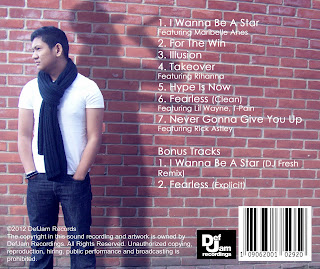
Inside CD cover (what the actual CD is placed over)

Our Magazine Advertisement
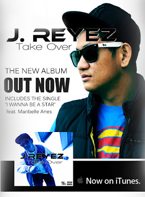
 Our magazine advertisement incorporates the artist. It shows clearly the album is available from iTunes and also shows the front cover of the album. The black and white main colours show the artists image is important compared to the background which contrasts against the artist making him stand out. We have carried the same fonts over from our Digipack, the artists name is in the same font and the album name is also in the same font. This was important as an artists font/style needs to be easily identified as their own e.g well known artists such as Chris Brown and David Guetta use the same font on every album they create so they are easily recognisable even if their s no image of the artist on the front. We used the same fonts so that when people glance at the magazine advertisement or digipak they begin to know and recognise our artist straight away.
No comments:
Post a Comment